

Beyond the Logo
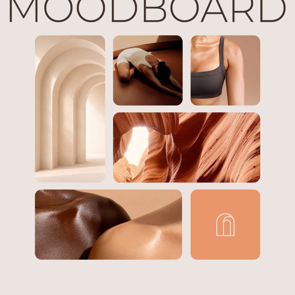
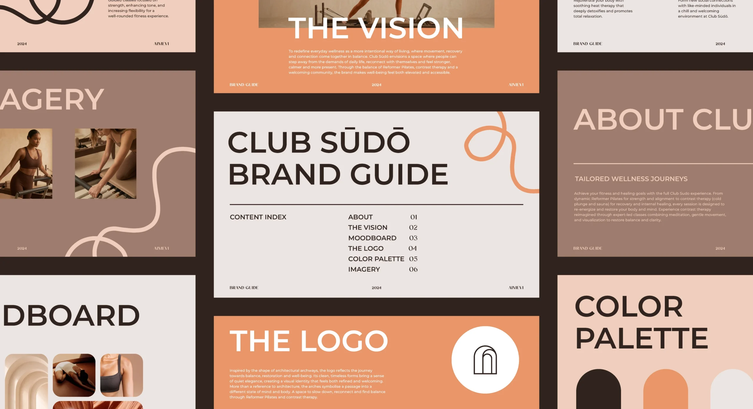
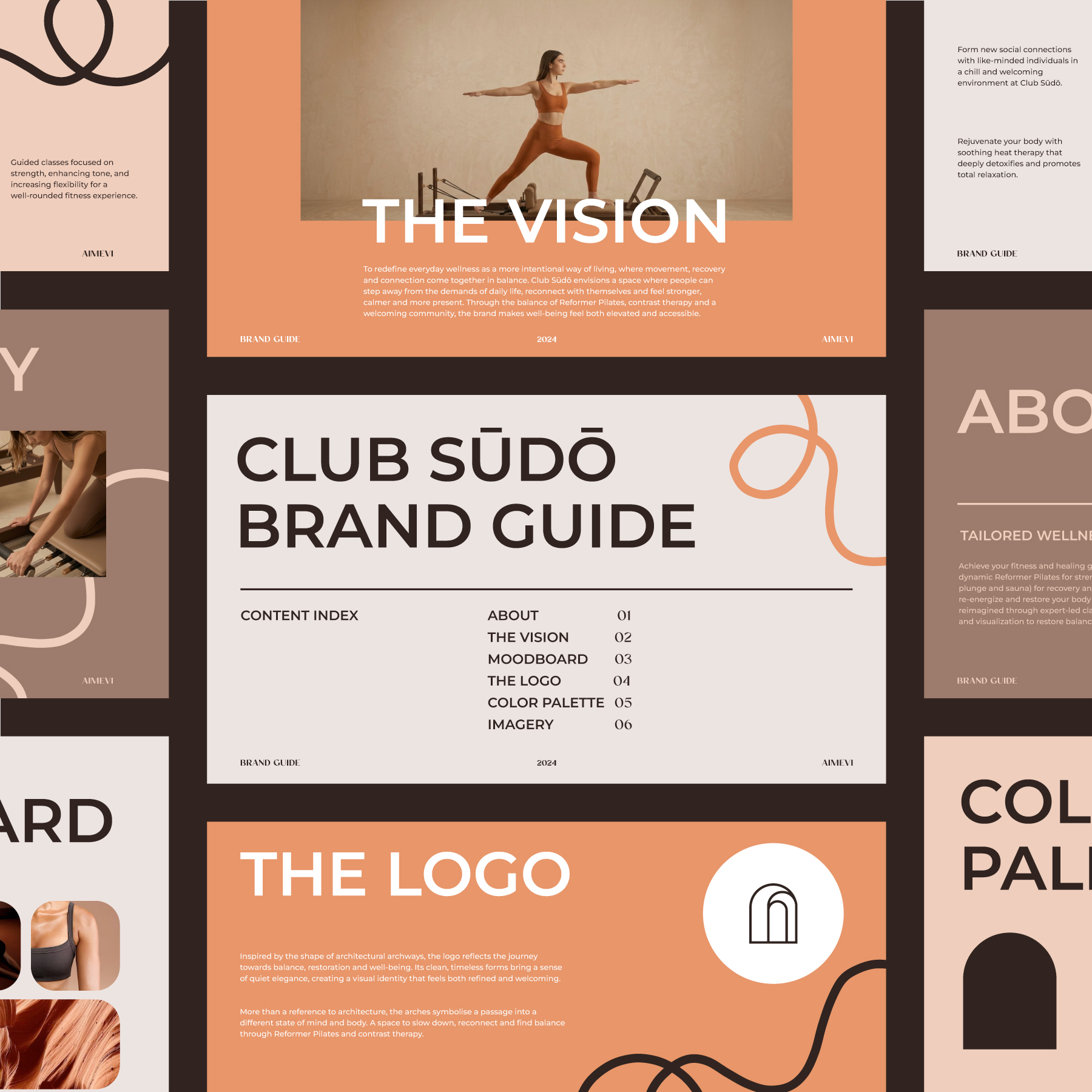
The visual identity for Club Sūdō began with research into the wellness industry, the studio’s positioning, and the balance between movement, stillness, and restoration. From there, I explored different visual directions through moodboards, sketches, and initial logo concepts, gradually shaping an identity inspired by architectural forms and a series of arches.
The logo was designed to express the transition between spaces and states of being, reflecting the studio’s focus on both physical movement and mindful recovery.
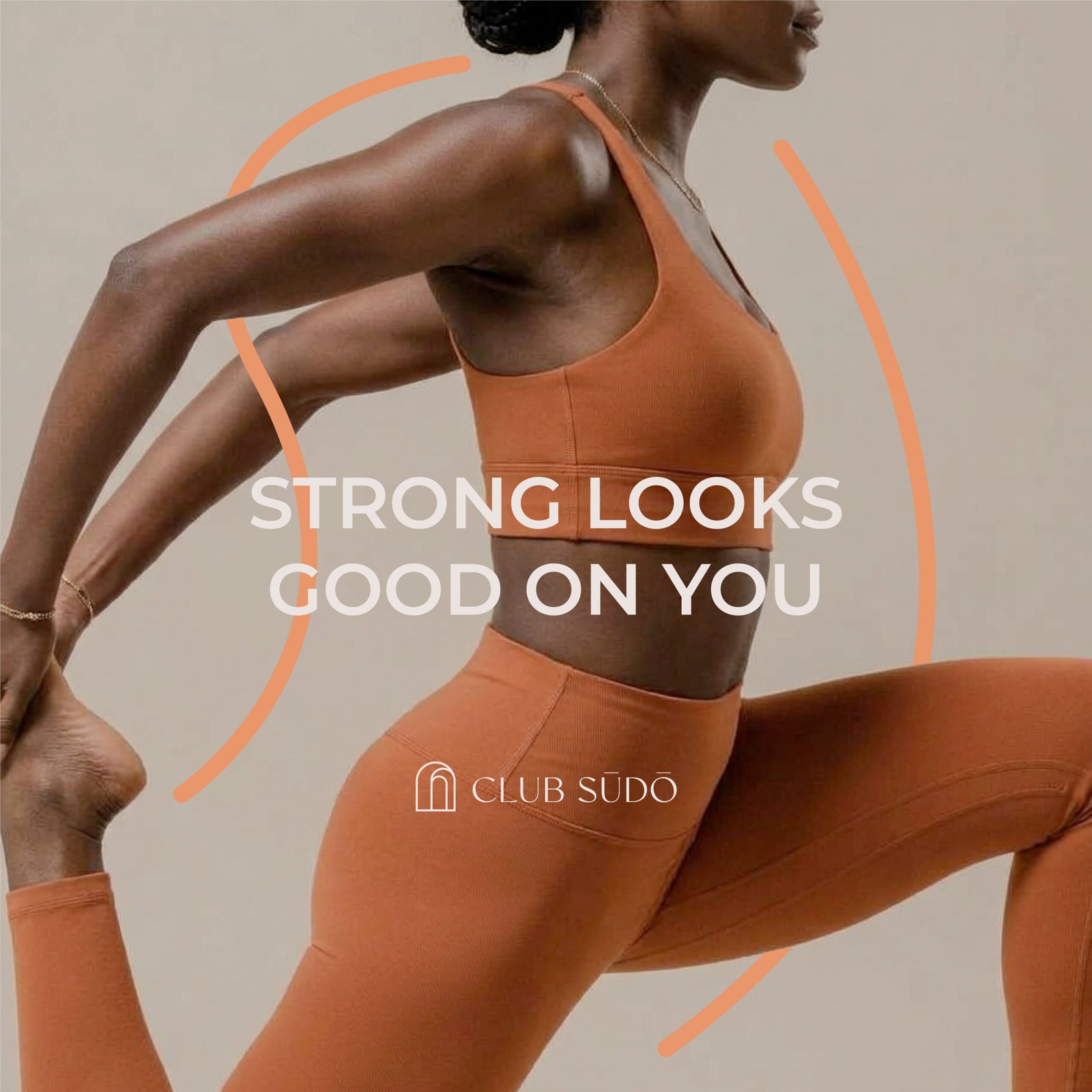
This concept became the foundation of the wider visual language, carried through the colour palette, typography, and supporting graphic elements to create a cohesive and considered aesthetic. The identity was then extended to social media templates, ensuring a consistent visual presence across the brand’s digital touchpoints.

Beyond the Identity
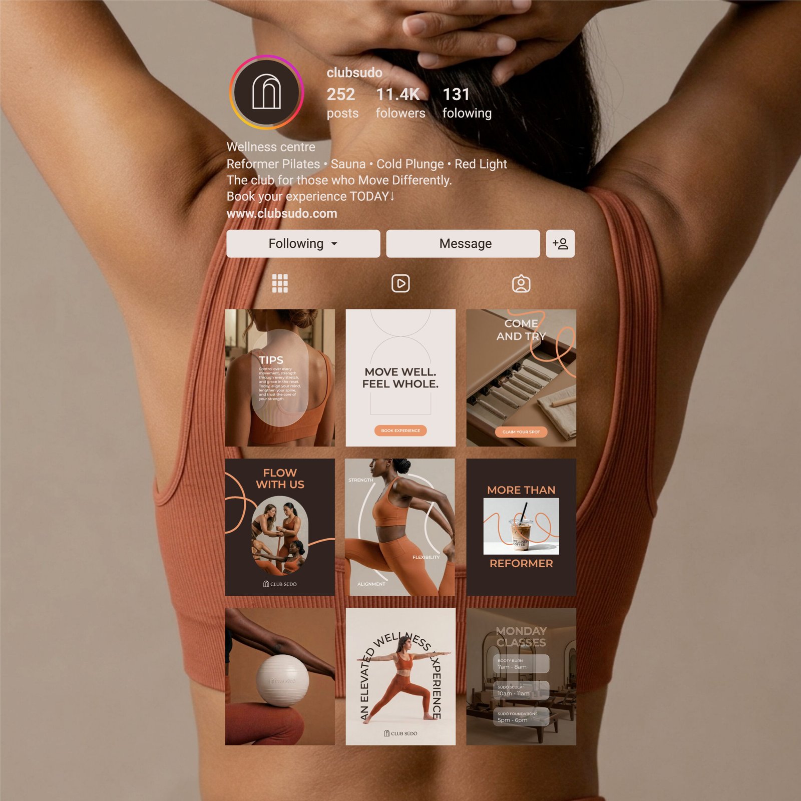
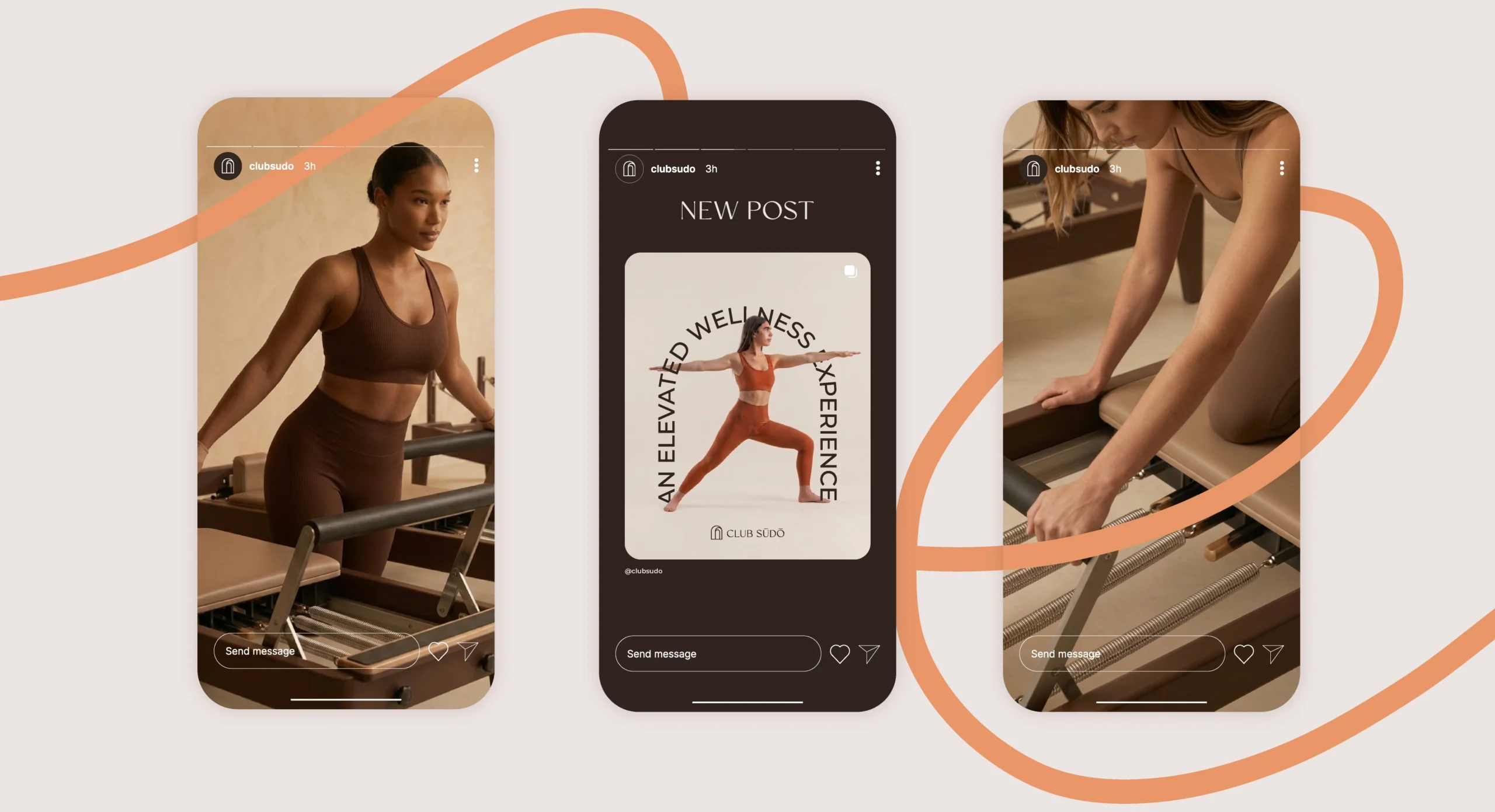
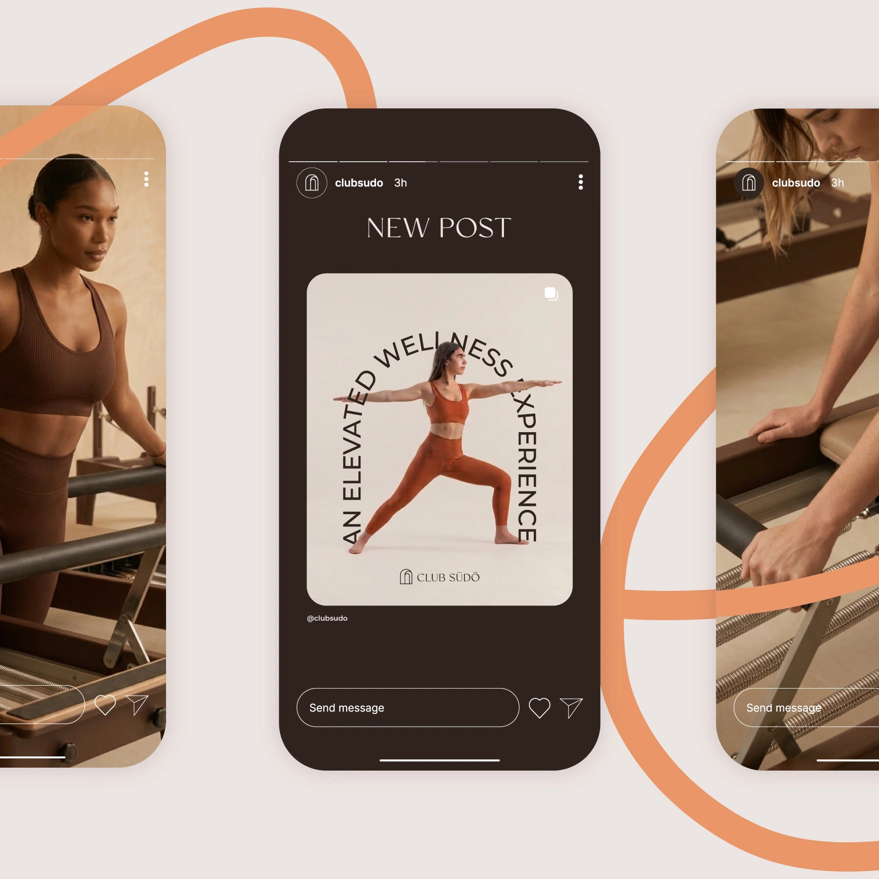
Extending Club Sūdō’s visual identity into the digital space meant translating the brand’s philosophy into a social media presence that feels as considered as the studio experience itself. Building on the visual direction established for the brand, I developed a social media concept that brings together typography, colour, imagery, and graphic elements to create a distinctive and recognisable visual language.
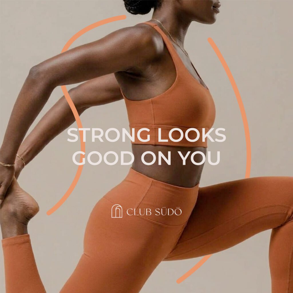
The approach focused on finding the right balance between consistency and variation, allowing each post to feel part of a cohesive whole while adapting to different communication needs, from introducing the studio and its services to highlighting its approach to wellness.
This direction informed the design of a flexible set of social media templates, created to simplify content production while maintaining a strong and coherent brand presence across the feed. More than a collection of individual layouts, the templates form a considered visual system that gives Club Sūdō the tools to communicate with clarity, build recognition, and express its identity consistently over time.
Club Sūdō

Beyond the Logo
The visual identity for Club Sūdō began with research into the wellness industry, the studio’s positioning, and the balance between movement, stillness, and restoration. From there, I explored different visual directions through moodboards, sketches, and initial logo concepts, gradually shaping an identity inspired by architectural forms and a series of arches.
The logo was designed to express the transition between spaces and states of being, reflecting the studio’s focus on both physical movement and mindful recovery.
This concept became the foundation of the wider visual language, carried through the colour palette, typography, and supporting graphic elements to create a cohesive and considered aesthetic. The identity was then extended to social media templates, ensuring a consistent visual presence across the brand’s digital touchpoints.
Beyond the Identity
Extending Club Sūdō’s visual identity into the digital space meant translating the brand’s philosophy into a social media presence that feels as considered as the studio experience itself. Building on the visual direction established for the brand, I developed a social media concept that brings together typography, colour, imagery, and graphic elements to create a distinctive and recognisable visual language.
The approach focused on finding the right balance between consistency and variation, allowing each post to feel part of a cohesive whole while adapting to different communication needs, from introducing the studio and its services to highlighting its approach to wellness.
This direction informed the design of a flexible set of social media templates, created to simplify content production while maintaining a strong and coherent brand presence across the feed. More than a collection of individual layouts, the templates form a considered visual system that gives Club Sūdō the tools to communicate with clarity, build recognition, and express its identity consistently over time.
Club Sūdō