
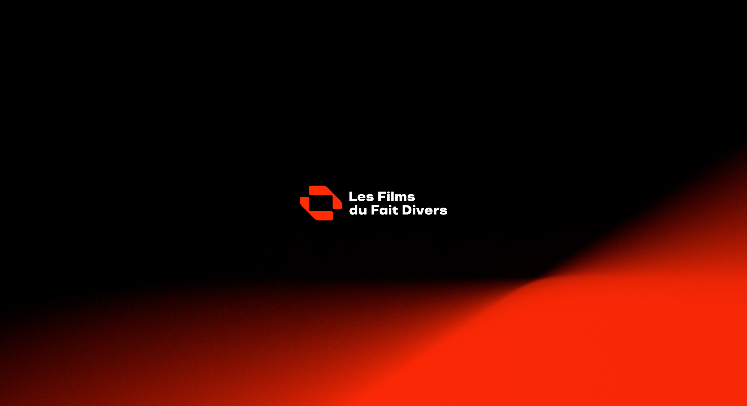
I designed the brand identity and the website for Les Films du Fait Divers, a film production company with no website and a logo that no longer reflected its world. The old mark was visually complex, with no clear concept and no visual system behind it. I treated the website as part of the same project: a new identity first, then a digital experience built on it. The direction mixes cinematic references with a restrained editorial look. Brand identity, art direction, UX/UI design in Figma and WordPress development all follow one logic.
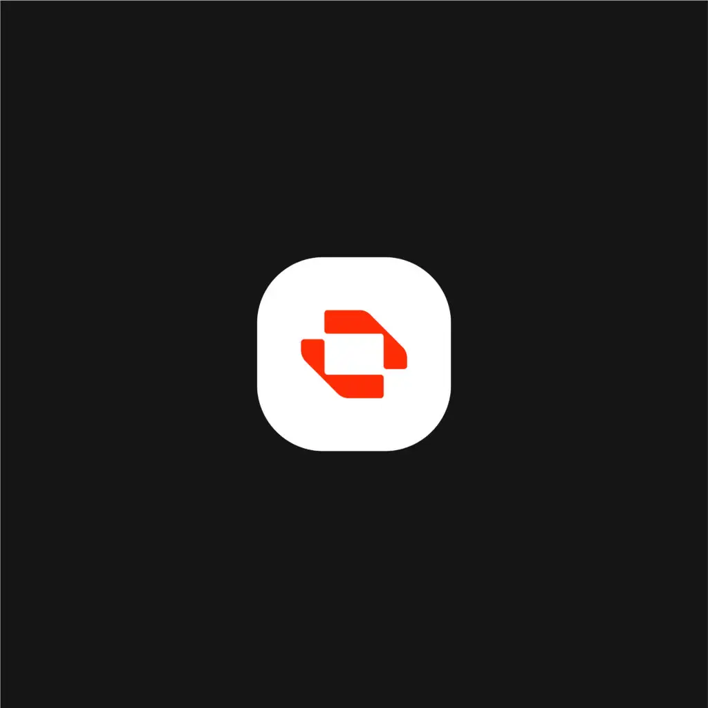
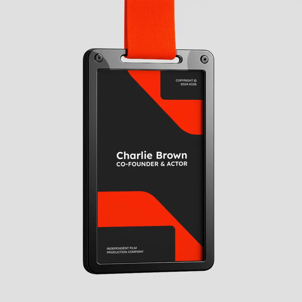
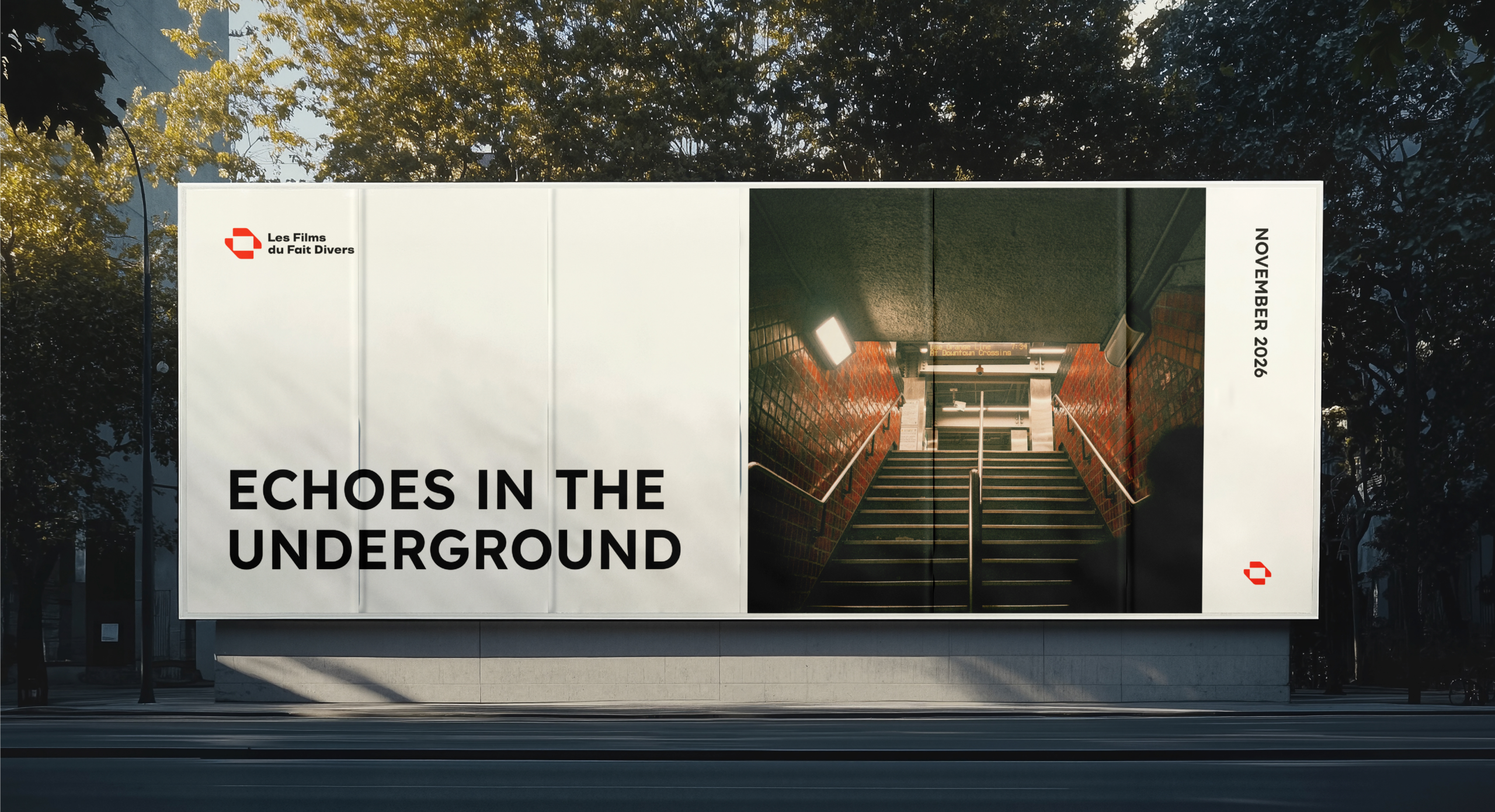
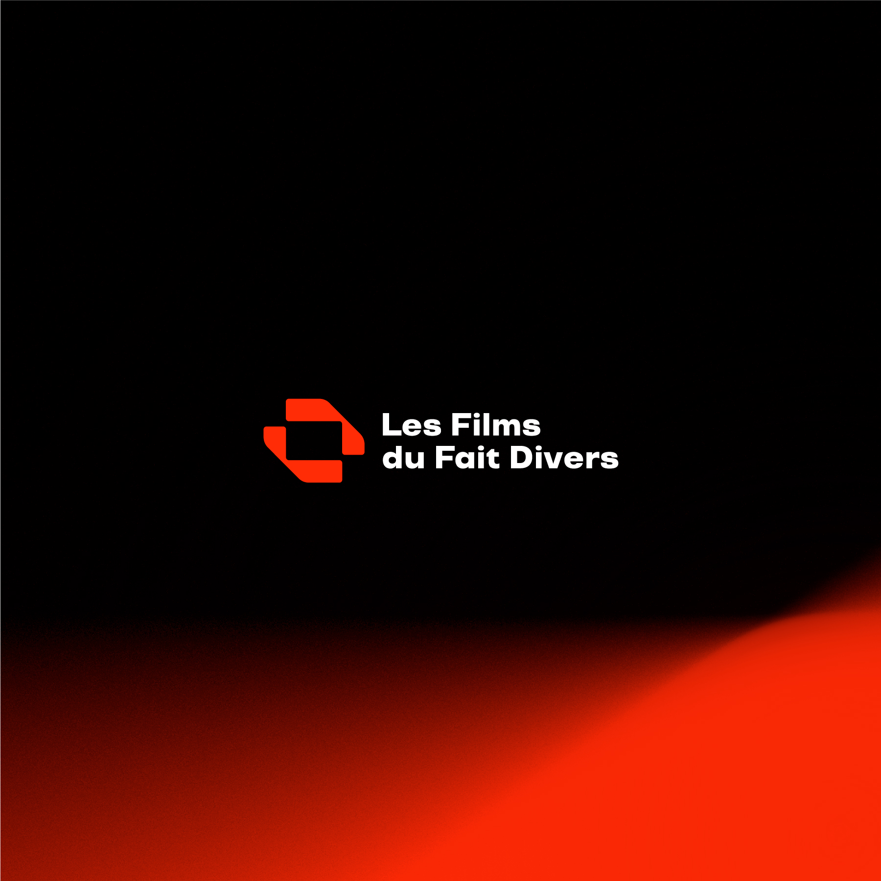
At the heart of the identity is an icon built around collaboration and creative direction. Two abstract geometric forms stand for the company's two partners. Put together, they evoke two hands forming a frame, the gesture directors use to picture a shot and set a composition. It points to filmmaking without using literal film imagery. The geometric construction keeps the mark clean, contemporary and easy to adapt across digital and physical formats. Red brings creative energy and passion, while black and white add contrast, precision and restraint. Together, these choices give the company an identity built around collaboration, creativity and storytelling, and a solid base for its new website.
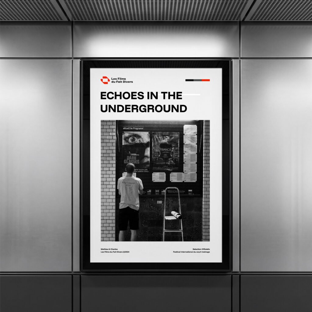
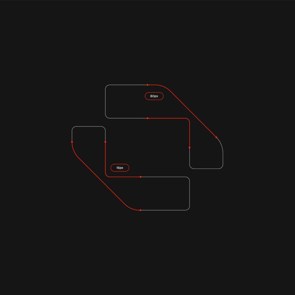
Les films du fait divers
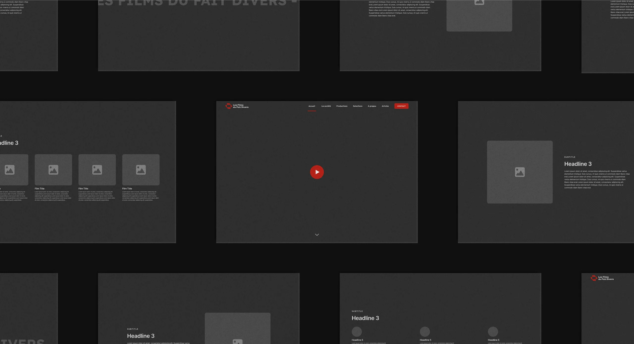
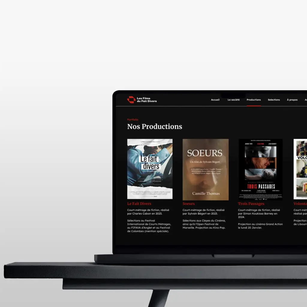

I designed the brand identity and the website for Les Films du Fait Divers, a film production company with no website and a logo that no longer reflected its world. The old mark was visually complex, with no clear concept and no visual system behind it. I treated the website as part of the same project: a new identity first, then a digital experience built on it. The direction mixes cinematic references with a restrained editorial look. Brand identity, art direction, UX/UI design in Figma and WordPress development all follow one logic.
At the heart of the identity is an icon built around collaboration and creative direction. Two abstract geometric forms stand for the company's two partners. Put together, they evoke two hands forming a frame, the gesture directors use to picture a shot and set a composition. It points to filmmaking without using literal film imagery. The geometric construction keeps the mark clean, contemporary and easy to adapt across digital and physical formats. Red brings creative energy and passion, while black and white add contrast, precision and restraint. Together, these choices give the company an identity built around collaboration, creativity and storytelling, and a solid base for its new website.
Les films du fait divers


I can help with brand identity, websites, social media and print. Tell me what you need.
I can help with brand identity, websites, social media and print. Tell me what you need.